
A current list of tools for Wardley Mapping is maintained over at LearnWardleyMapping.com.
This post has two main sections: A semi-serious reflection on the problem space of tools for mapping, and then a fun overview of all sorts of mapping tools and techniques, informed by discussion and sharing that took place at the inaugural Map Camp.
A Reflection on Mapping Tools
I hold two conflicting views on sophisticated mapping tools.
1. The tools matter.
- Well-designed tools can accelerate the learning process exponentially.
- If tools can reduce the friction of the mapping process, then more energy can be devoted to questions that matter, such as, “Why here over there?”
- Mapping tools with a disposition towards becoming a commodity could unleash a faster pace through the Strategy Cycle (efficiency enables innovation, after all).
On the other hand…
2. The tools don’t matter.
- The use of tools to share polished maps can signal expertise, a sort of “correctness,” and perhaps a position of knowledge-centric authority. I believe these attributes can stifle the kind of discussion and assumption-challenging that is desirable while mapping. (Chris Matts makes some interesting points on keeping things less polished in his 2016 talk on community at Lean Agile Scotland).
- Tools can distract new practitioners from learning how to map. Learning requires study, thought, and lots of practice. Sophisticated tools can provide a false sense of comprehension, which hampers the learning process and opens up the possibility for developing bad habits.
- Software? Who needs it! Pencil and paper is always an option.
I have no intention of resolving these conflicting views, as I think they are both important to consider. I recommend keeping them in mind as you continue below.
Also, a resonating theme for me at map camp was the importance of sharing our unpolished, scribble-filled, work-in-progress maps. Tools can definitely make maps look nice, but we need to emphasize the rough edges and imperfection as we bring new people into this growing community of ours.
Overview of Mapping Tools and Techniques
Pencil and Paper: Value Chain
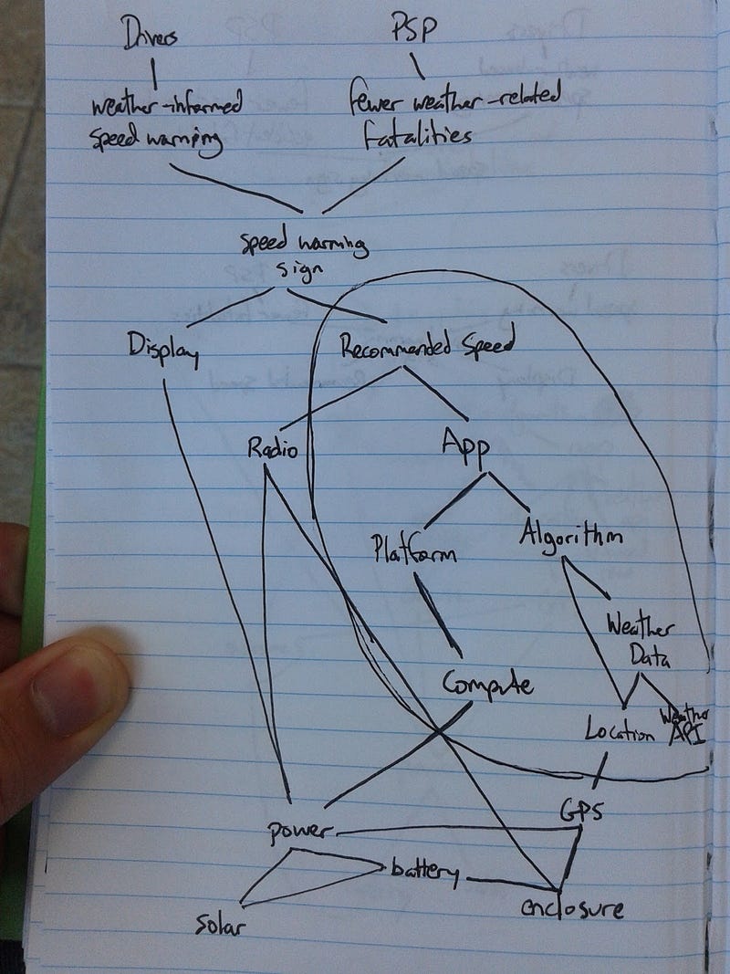
As I elaborated at Map Camp, I tend to draw, redraw, and draw again with pen and paper until I have something I’m comfortable with. I often stop at a value chain and then translate it to software, as it can be difficult to play with evolution in this format.
Pencil and Paper: Intermediate Component Evolution Diagram
One possible solution for pencil-and-paper evolution is to create an intermediate diagram to classify each component’s evolutionary position one-by-one before drawing the final map, ignoring the value chain for a moment.

Pencil and Paper: Sticky Flag Components
Another possible solution is to represent components with sticky flags or transparent tape, place and re-place the components until satisfied, and then fill in the connections.


Blue Tack and Yarn

This one is fun if you enjoy hyper-tactile experiences. Making use of a full wall can really help with getting into the flow of mapping a problem space.
Sticky Notes + White Board

This method is described in detail in Simon’s post, Mapping a Company. Again, I often switch to software when I need to play with evolution, but evolution can easily be represented with stickies/post-its and a white board.
RealtimeBoard + Wardley Mapping Canvas
RealtimeBoard is a whiteboarding tool for online collaboration. Just register a free account, create a new board, and choose the Wardley Mapping Canvas from the available templates! Read more about it here.

[convertkit form=894710]
OnlineWardleyMaps
https://twitter.com/damonsk/status/1066830382262308870
A text-based generator for Wardley Maps by @damonsk Available at: http://onlinewardleymaps.com/
Kumu.io

Full introduction here: https://hiredthought.wordpress.com/2018/12/11/wardley-mapping-on-kumu-io/
Wardley Map Chat
If you’re learning how to map for the first time, Wardley Map Chat can guide you through creating your first map in no time at all. Just answer the questions and open your map!

Google Slides

My first attempt at digital map representations was with Google Slides (you can check out the template here).
Since the way the labels overlap with the component placeholders in the template can confuse the “snap-to X” interface, connecting components can be frustrating at times. I find holding alt (option) while connecting a line to a component circle works best:

Because connections are made to the outer edge of the component circle shapes instead of the center, moving a component around can cause some undesirable visual alignment effects.
Google Slides (Speech Bubbles)

At Map Camp, Richard Barton shared another approach that uses Google Docs and circumvents both issues mentioned in the previous example. This method, as documented by Ben Cheetham, uses speech bubbles instead of complicated shapes and labels. Inspired by the idea, I took a shot at putting together a template.
PowerPoint
PowerPoint is usually what I use for sharing and communication (you can check out the template here).
As an aside, the trick to being able to connect lines to the center of a component node was to use a semicircle shape instead of a circle and adjust it to have the appearance of a full circle.
Atlas 2

Atlas 2 is a comprehensive open-source mapping tool capable of greater granularity in representing components, including the option of including submaps. There are a lot of interesting features, and it’s available for use at atlas2.wardleymaps.com.
Flying Logic: Value Chain Oriented Spot Painting
This is a shorthand technique I’ve been using to provide just enough structure for small-scale problem-solving. Basically, it takes a value chain and then expresses evolution as categories instead of having specific placement on the horizontal axis.

I was inspired by a comment Dave Snowden made about the Cynefin framework, suggesting that it can be used as a categorization framework to great effect (even if that’s not where the real power of the tool is). Likewise, I thought there might be a similar kind of utility with this spot painting method, assuming some kind of tradeoff (perhaps a lower ceiling of potential strategic possibility).
Originally, I intended this to be useful as a beginner’s tool, but after some discussion with Simon, it became clear that he already had thought about it and identified some dangers:
- With no x-axis, the landscape isn’t visible (spatial thinking isn’t engaged), so it’s not as obviously challenging.
- Without movement, it’s basically impossible to grasp climatic patterns.
- Patterns are much harder to discover (e.g., how can something like coevolution of practice be represented in this format?).
Simon goes further in his critique of spot painting in Chapter 8: Keeping The Wolves at Bay. My take on the method uses a value chain, though, instead of a business process diagram, so there are some interesting differences.
Ultimately, I view it as a short-hand for those already comfortable with climatic patterns. For me, it’s low-friction enough to do at the beginning of any project, no matter how big or small. Here’s an example of the technique as applied to an ebook publishing project:

The technique provided just enough structure to realize that this seemingly massive undertaking could be completed in about 2 weeks if we preempted our biases and outsourced the appropriate aspects (Kindle Direct Publishing is pretty neat).
You can find the Flying Logic software here (a 30-day trial is available) and a template I’ve developed for it here (save the file with an extension of .xlogic-t).
Flying Logic isn’t intended for this use (it’s built more for methodologies like the The Logical Thinking Process, which is related to the Theory of Constraints), but it works well enough to be useful.
Wardley Maps as Code
At Map Camp, Richard Barton shared a useful script he wrote that converts a code representation of a Wardley Map into an SVG image. We had some interesting discussion about how it could enable portability across different tools, and there’s already been some experimentation around implementing it in Atlas2.

Have a look at the project and the corresponding jsfiddle to see more and try it out!
Evolutionary Characteristic Cheat Sheet
A while ago, I developed an open-source tool to improve the experience of learning about and using the Evolutionary Characteristics Cheat Sheet. The tool has an improved visual aesthetic and offers the ability to temporarily mark characteristics to assist with discussing how evolved a component is. It’s available at archive.learnwardleymapping.com/archive/.

Even More Tools
Full write-ups for even more tools are available over at LearnWardleyMapping.com, including for:
- Archi
- Diagrams.net (Draw.io)
- Figma
- Google Slides
- Keynote
- Kumu
- LucidChart
- Miro
- Mural
- OmniGraffle
- PowerPoint
- and more.

4 responses to “Wardley Mapping Tools and Techniques”
[…] With respect to tools, Ben Mosoir summarises what’s being used, adding some reflection on tooling in general. […]
LikeLike
Thanks, this is a really cool page
LikeLike
Thanks for the fantastic ideas. They’re a great addition for modeling Architecture Strategy.
LikeLike
[…] first ever post about Wardley Mapping tools was in 2017, and at the beginning I mused about a […]
LikeLike